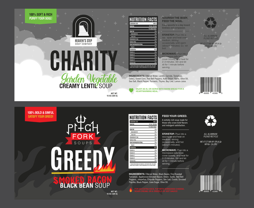
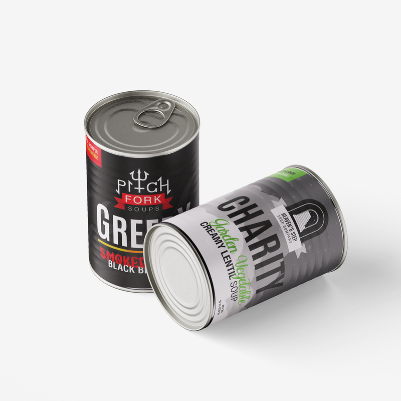
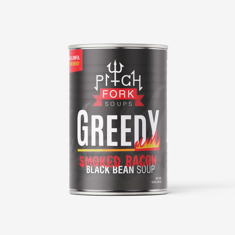
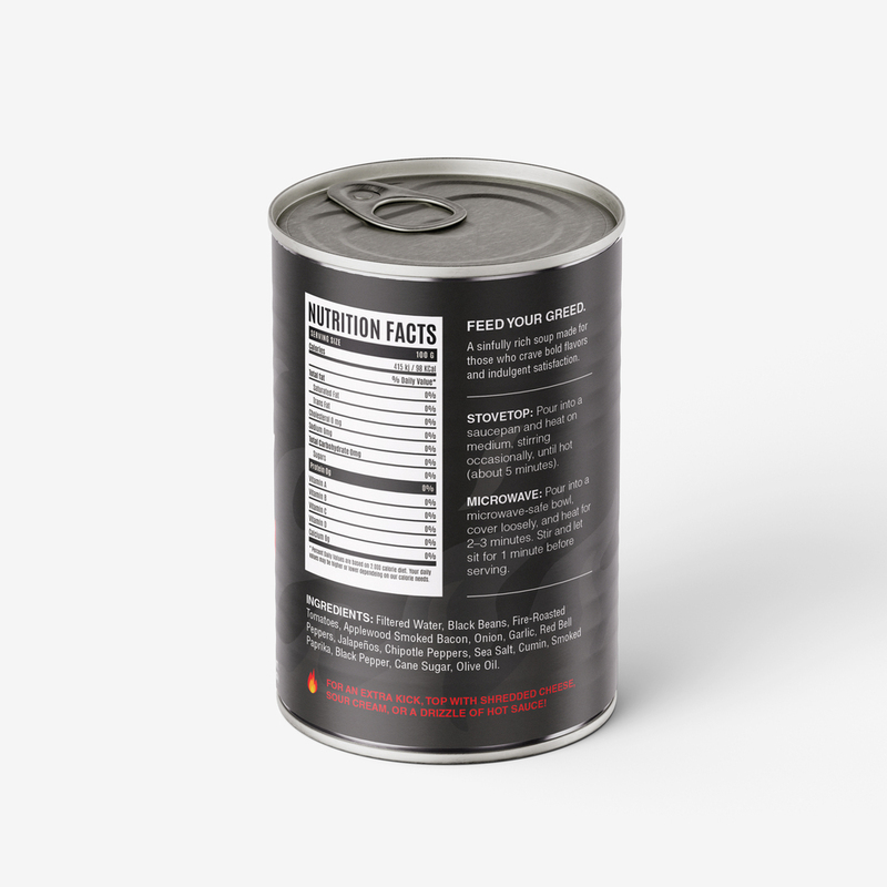
Greedy x Charity
soup can design
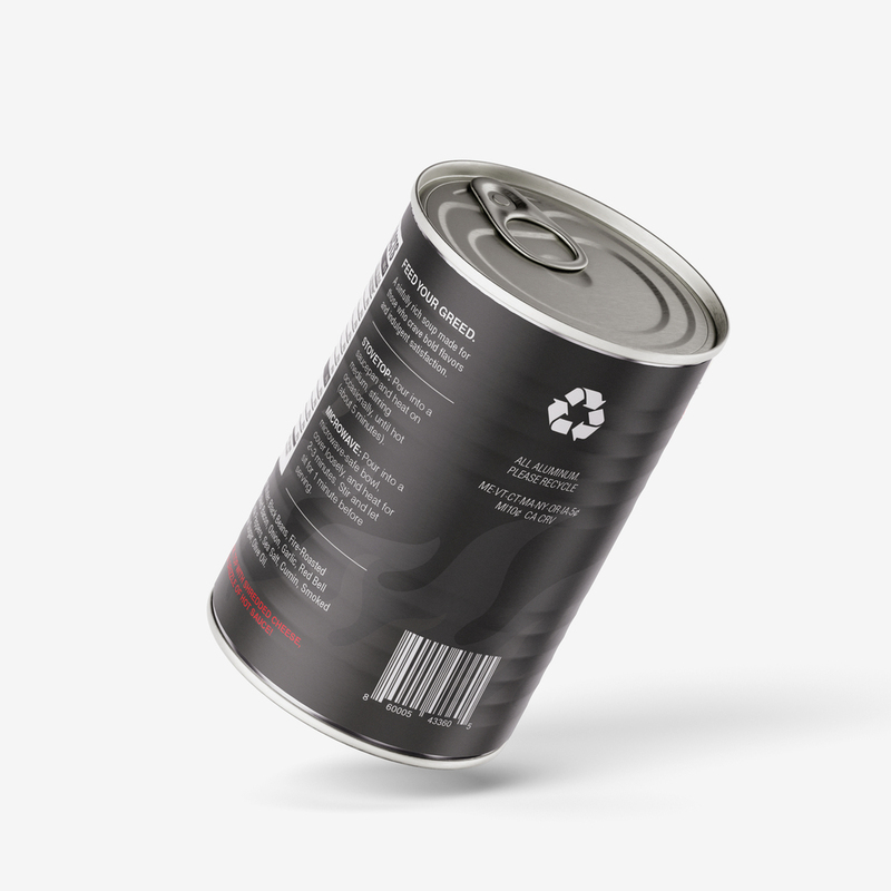
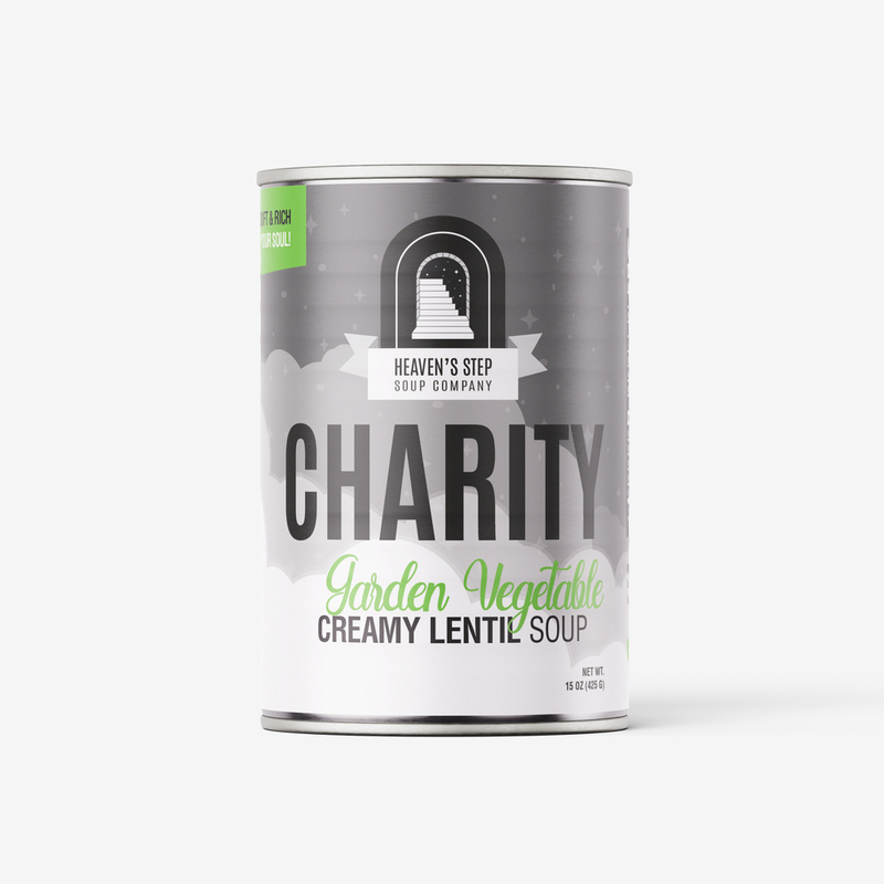
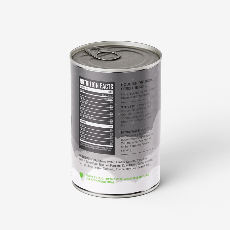
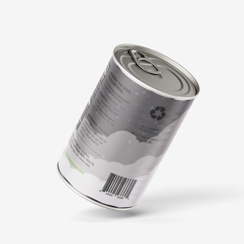
Soup Can Design is a conceptual packaging project that explores the contrast between opposing human values through product design. Inspired by the words Greed from the Seven Deadly Sins and Charity as its opposite virtue, the project transforms a standard soup can into a visual narrative that wraps around the entire package. The design uses contrasting imagery, typography, and composition to illustrate the tension between excess and generosity while encouraging viewers to reflect on the choices that shape society.